
BRAINSTATION CASE STUDY
My Role
User Research
User Flows
Visual Design
Rapid Prototyping
Usability Testing
Timeline
2023
Overview
For new cyclists, BikeIt is a route-planning app that integrates bike lanes, BikeShare, and transit to generate optimal cycling routes to their destination within Toronto.
This is my final case study project for the UX design course at BrainStation where we learned to frame a design problem and design a solution.
THE PROBLEM
DESIGN CHALLENGE
Design the ideal transit app.
At first glance, transit apps can help easily access schedules and live GPS tracking. I discovered that, for many people, this wouldn't solve their bigger pain point of transit delays and cancellations.
Many have solved the traffic problem with bikes and rental bikes, however, this created another pain point with finding safe, beginner routes that can be incorporated in a daily transit commute.
Transit apps failing to support new cyclists
Current public transit apps for planning routes don't accommodate for cyclists and don’t provide enough information to encourage the use of bikes or rental bikes (BikeShare) for transit.
The #1 route-planning app currently used by tourists, daily commuters, and occasional commuters in Toronto is Google Maps.
New cyclists using Google Maps cannot generate routes with both transit and cycling, and cannot see rental bike options.
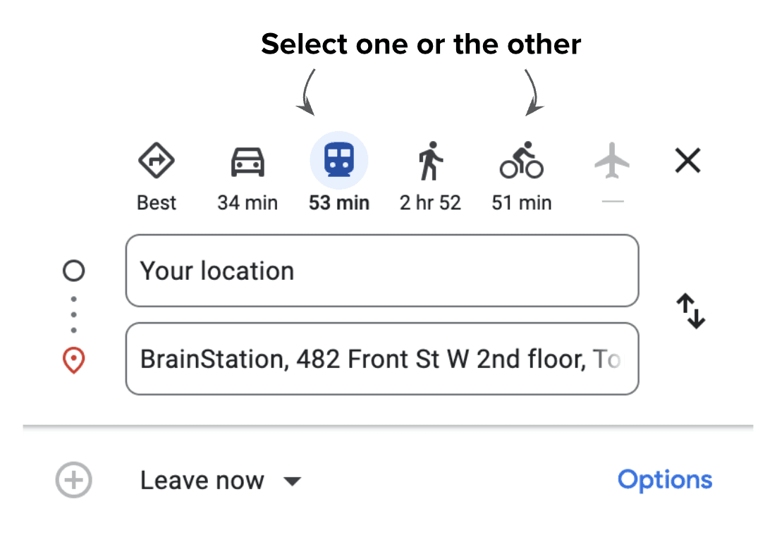
Google Maps route planner
DISCOVERY
How might we improve the route planning process for Toronto commuters new to cycling to encourage the use of their bike or Bike Share?
We created a set of user interview questions to better understand their current journeys and pain points.
Walk me through the typical steps you take when planning a route.
What key criteria influenced your planning process?
What features would better accommodate or encourage you to use a bike?"
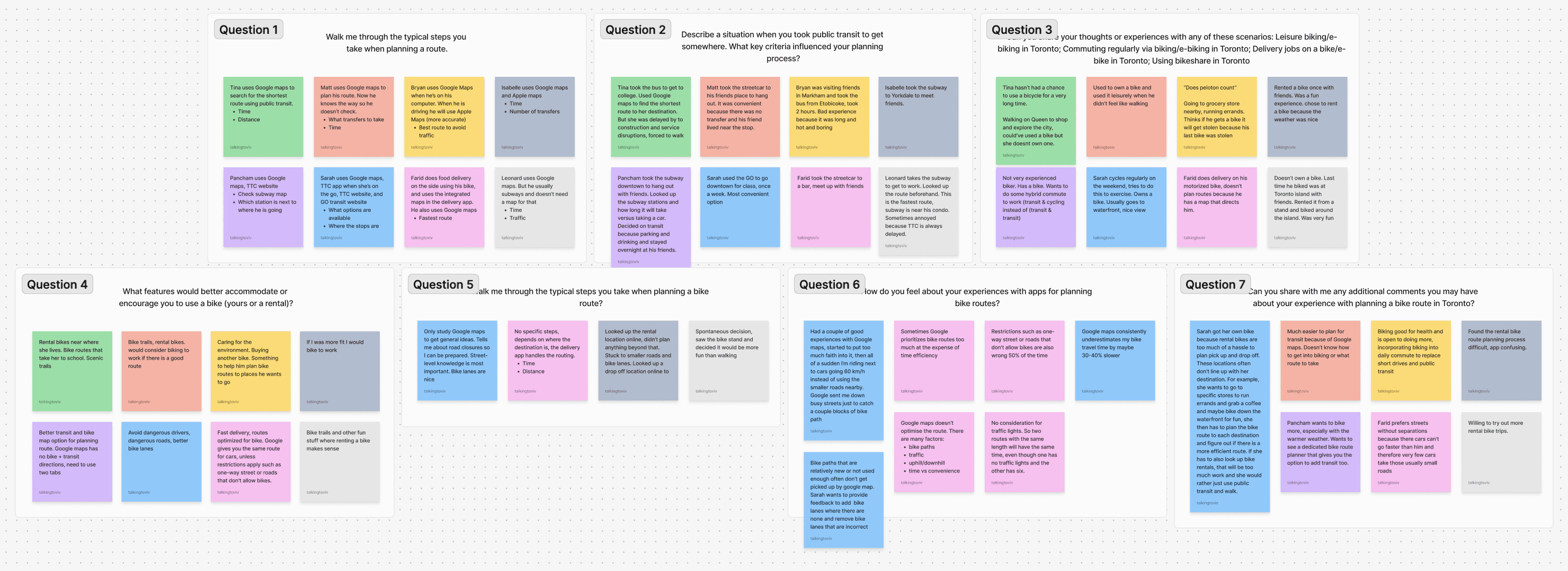
User research interview questions and answers
RESEARCH
Themes
Theme 1: Time
Distance and time are key factors when choosing between bike or transit.
Traffic, delays, and construction are common and make commutes longer.
Commuting to downtown by bike is far, they don’t want to arrive too tired or leave too early.
Theme 2: Environment
When the weather is warm and sunny, they want to spend time outdoors walking or cycling.
Staying healthy and active are very important factors in their lifestyle.
Cycling and Bike Share are healthy, sustainable options for travel.
Theme 3: Experience
Overcoming barriers to cycling through familiarity and experience with the roads.
They rely on Google Maps for navigation and planning when they are unfamiliar with the roads.
They prefer to start with leisure cycling in low-traffic, parks, or bike paths to build confidence.
"I tried to take my bike to the train station and Google Maps kept throwing me into heavy traffic even though I know there were bike lanes on my way…”
Insights
My interviewees were more willing to cycle if they had transit options to take them closer to parks and leisure bike routes first.
A tool to generate optimal bike routes based on distance, traffic, and experience can help lower the barriers to cycling while promoting healthy exercise.
User Persona

Kurt Li
Optometrist/28/Male
Outgoing Urban Explorer
Kurt is a tech-savvy urbanite who is interested in cycling as a fun exercise activity. He prefers transit for commuting, but he recently bought a bicycle to hopefully use in his usual route. Kurt sees cycling as a good opportunity to explore the city and promote sustainability while avoiding bad Toronto traffic.
Behaviours
Tech savvy, uses Google Maps for navigation.
Eager to explore new activities that promote healthy exercise.
Loves the outdoors, likes to choose environmentally friendly alternatives.
Pays attention to small details, time, and efficiency when it comes to planning routes.
Needs
Cares about his health, physical activity, and sustainability
Recently purchased a bike and wants to incorporate more cycling into his lifestyle.
Wants to overcome barriers to cycling by building confidence navigating the streets and bike lanes.
Frustrations
Parks that him and his friends like to visit are downtown and far from where he lives.
Limited knowledge lead to uncertainty about cycling and road conditions.
Needs to manually switch apps to plan for transit and bike.
No rental bike information on Google Maps.
“I know cycling is good for my health and I’m open to doing more, like incorporating biking into my daily commute to replace short drives and public transit.”
Kurt's goal:
An easy way to plan cycling routes optimized for his experience level using a combination of transit, his bike, or rental bikes, that also offers curated cycling trails to explore.
INFORMATION ARCHITECTURE
BikeIt App
The first issue I encountered when laying out a user journey was that planning routes would be useless without a way to follow the route.
Don't change what isn't broken - Google Maps is widely adopted for its navigation function, so it would be a huge challenge to switch users onto a new navigation function on BikeIt.
It became apparent that the best solution is to synergize BikeIt's route generation with Google Maps' navigation system. Together they would create the optimal user journey for cycling commutes.
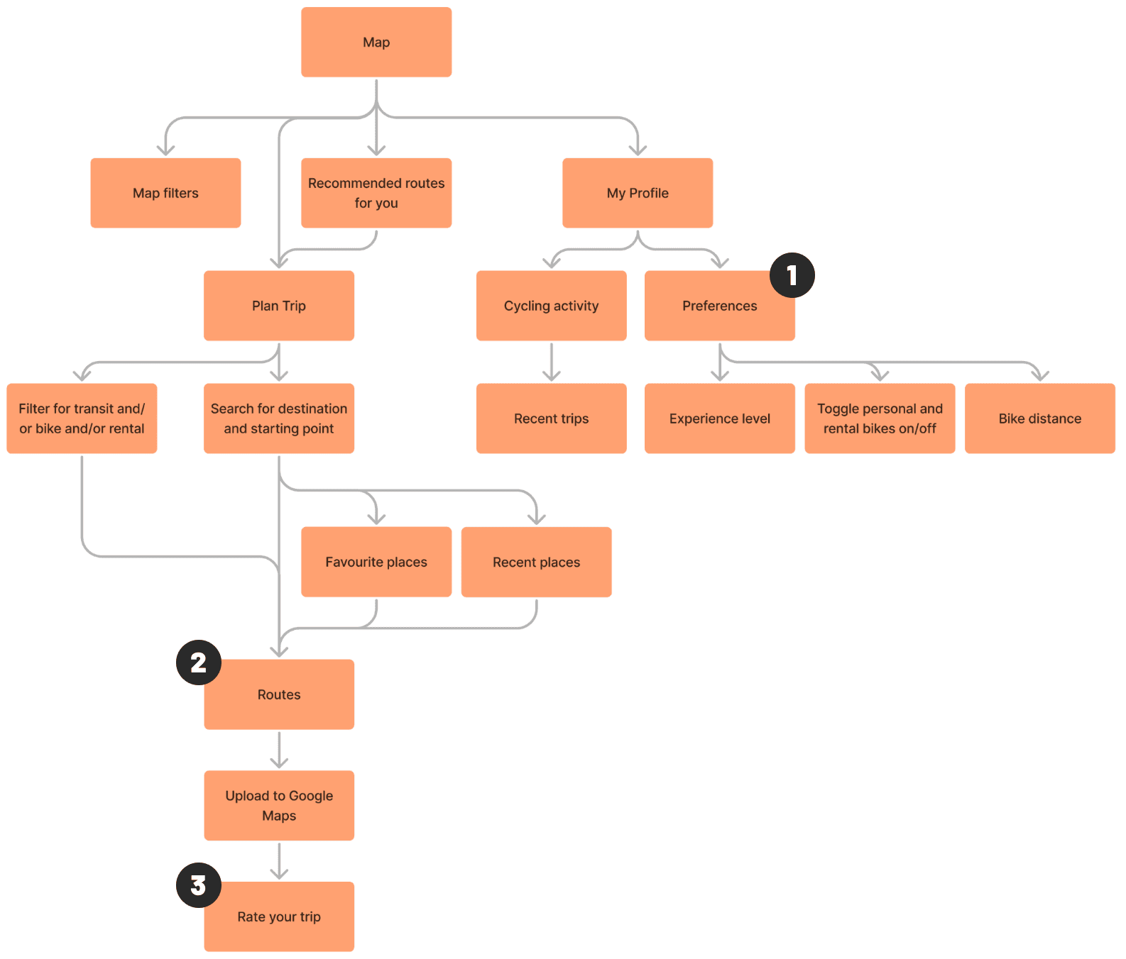
1
Preferences can be auto-filled based on experience — helpful for new cyclists.
3
Return to app after completing the route to collect feedback for the next trip.
2
Route directions sent to Google Maps for real-time navigation.
USER FLOW
Laying out the two primary tasks.

User task #1
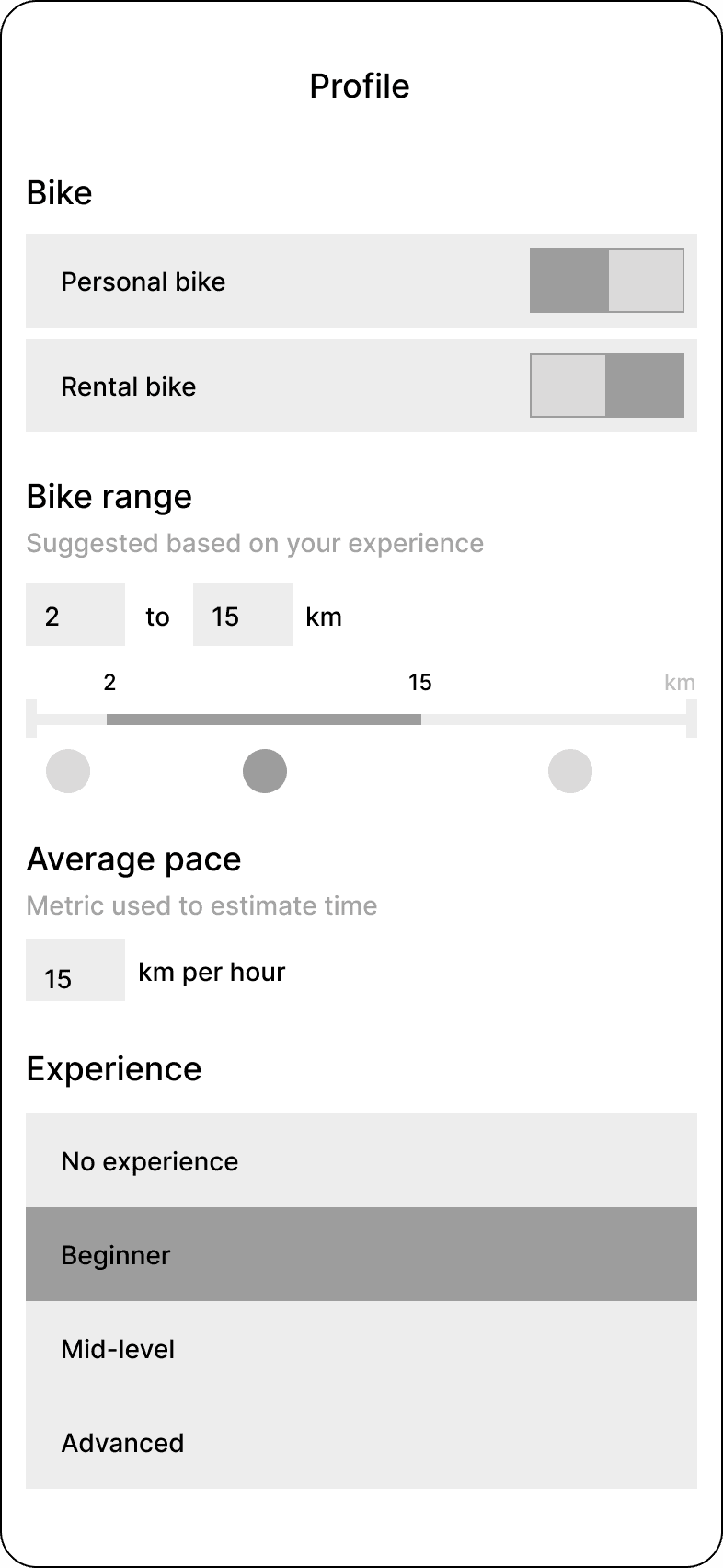
Set up your profile with information about your experience level and rental preference to personalize the routes you generate.
Transit, bike, and/or rental bike options based on your preferences.
Setup process should be easy and responsive - then adapts as use the app
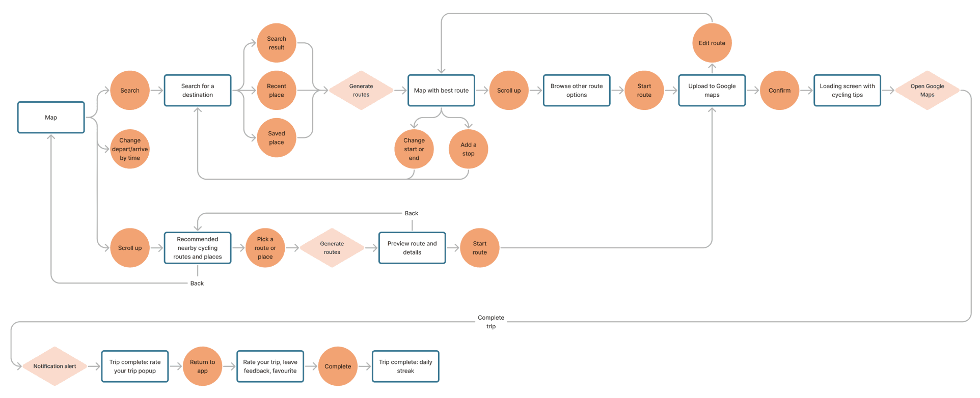
User task #2
Plan a route or recommended route to import into Google Maps. After completing your trip, return to the app to rate, favourite, and add to your daily streak to encourage more cycling.
No specific destination? Pick a recommended route at a nearby park or trail.
Encourages the use of bikes in daily commute with saved routes and cycling streaks.
WIREFRAMES
From sketches to low-fidelity wireframes for early testing.

Sketches of main BikeIt app layout

Wireframes of main BikeIt app layout
DESIGN IMPROVEMENTS
Getting the changes in early saves time later.
After some concept testing with a participant using a low-fidelity prototype created using the wireframes in Figma, 2 major improvements were made to the app design.
Improvement #1
Recent activity adds more value to profile section
V0.1 Functionality approach
Straight to the point with different settings options for route generation.
User won't be interacting with these settings very often beyond initial setup phase.
Focus is put on the user's selected experience level and does not motivate or add value.
Setup settings are mostly text and numerical with little visual elements
"I'm not sure what to do here, do I adjust these settings every trip?"

V0.2 Personalized approach
Stats generated based on user activity that might be of interest to the user.
Motivates the user to continue to use the app - improves retention
Greater scannability of user's overall progression and improvements.
Setup settings are hidden behind a separate tab which requires an extra tap to open.
"I'm a visual learner and seeing my cycling activity in a chart form is really helpful for my progression."
Improvement #2
Changed the layout of the map filters and routes for better flow

V0.1 Map filters and recommended routes are the main focus
Transit and bike filters were the most useful feature - and can easily be accessed.
Doesn't focus on the user's goal of getting to their destination.
At a glance, the map can be confusing with no clear visual heirarchy.
"How do I input my commute to work? Do I start with these buttons at the bottom?"

V0.2 Map filters and recommended routes are secondary to the main CTA: "Where are you going?"
Moving the transit and bike filters next to the search improved the flow of this screen.
Recommended routes are below the screen, and do not obscure the map.
Map can still be customized using the filters as the user needs.
"This map is much more clear, if I have a destination I look at the top, if I don't I browse the routes at the bottom."
VISUAL DESIGN SYSTEM
Vibrant and energizing.
Creating a design system for this project on Figma, is a fun exercise to hone my skills. The goal is to inspire movement with a fun, vibrant, and energetic palette.
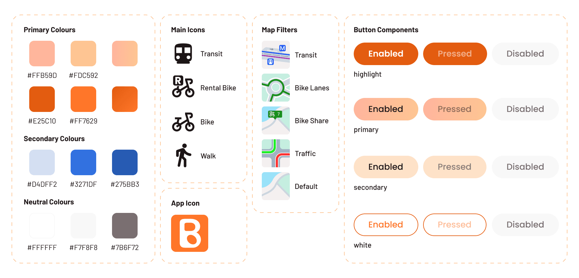
BikeIt style guideline
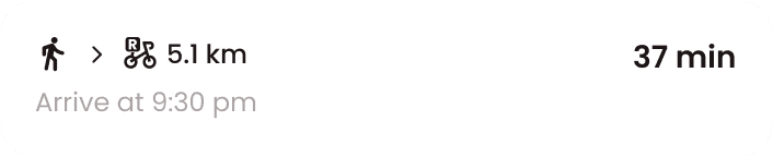
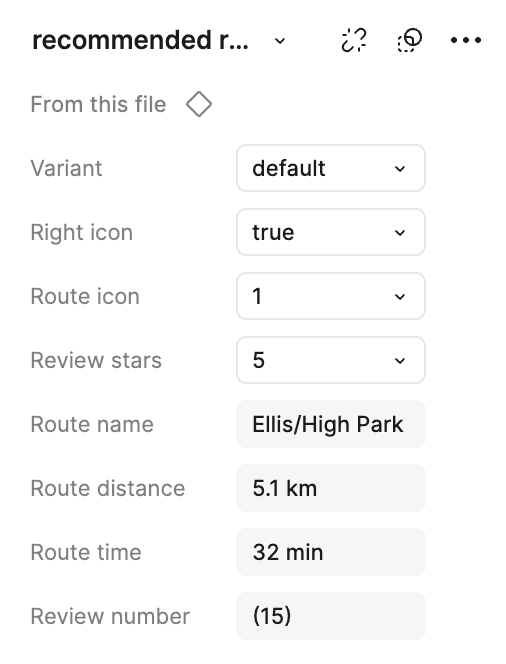
Using cards to standardize the design for different routes.
Using the component properties feature of Figma, I was able to speed up the process of creating designs for different routes.
The route cards are created for adaptability and responsiveness, accommodating any mix of transit, cycling, bike rental, and walking elements that might be part of the journey.
Transit route card


Recommended route card


FINAL DESIGNS
Generate routes for your experience level.
Set-up a personalized profile using just your experience level, with customization options available for advanced cyclists.
Afterwards, your cycling activity is visualized in your profile to showcase your progress.

First time user setup

Profile and cycling activity
Search for routes using any combination of transit, bike, or rental.
Accommodates longer distances using a combination of transit & bike. Rental bike locations are also directly visible on the map with information on available bikes.

Transit, bike, rental map filters

Search for directions
Curated leisure bike routes with directions from your location
Recommended routes features parks and trails around Toronto to explore on a personal or rental bike, with step-by-step directions from any location.
Afterwards, a push notification reminds you to return to the app to review and save the route for next time.

Push notification

Route details

Route completed
TAKEAWAYS
BikeIt began with a broad prompt - develop a transit app. After examining user practices, I pivoted my project to focus on both transit and cycling, as people in Toronto show more interest in using rental or personal bikes to get around.
This project was a great opportunity to learn and showcase my ability to combine user-centered design with strategic thinking to create impactful solutions, running usability testing, and iterating based on real feedback. I tackled the full process from writing and conducting user interviews, to wireframing, to visual design and brand development to create an app that addresses a growing need for a transit-cycling route planner.
Next steps…
With more time I would do a thorough inspection of the UI (WCAG, heuristics, etc.) and conduct tests on the prototype with more users to further test my assumptions and create iterations that can better fit their needs.
